Thursday, April 24, 2014

Best and Worst Movie Posters of 2013

A film poster is a poster used to advertise a film. It’s a simple enough concept, right? However, creating a striking movie poster is an art. It requires design, innovation, and intrigue. Some feature illustrations of a film scene or an array of overlaid images from several scenes. Other posters have used artistic interpretations of a scene or even the theme of the film, represented in a wide variety of artistic styles.

Some get it right. Some get it wrong. Some hit it out of the ballpark. A great movie poster doesn't just show you who is in the film, but how it will make you feel. Successful posters catch your eye, while misses just leave you scratching your head. Here are our picks for the best and worst posters of the year. 

BEST

1. Stoker
Hand-drawn, equal parts beautiful and creepy, this is vaguely Burton-esque, with its coffins and insect-y plant-life.

A little treasure trove of elements from the film, we could stare and dissect this for hours. What is the purpose of every little detail? Who died? Guess that’s why it’s a great film poster. It catches your attention, and you want to see what it’s all about.

2. Spring Breakers

True, James Franco’s been airbrushed to hell (and back), and there’s something slightly uncomfortable in the apparent exploitation of these bikini-wearing babes.

There’s no denying, though, that this ad campaign was both eye-catching, enticing and massively memorable. It shows the whimsy, the sexiness, the danger, and the personality of the movie as a whole. Say what you will about the film and its themes, but aesthetically, it’s a special kind of candy-cane brilliant.

3. The Secret Life Of Walter Mitty

Ben Stiller’s latest movie is one of those genre-defying oddities that we love, and the poster makes no bones about the fact that Walter Mitty is almost impossible to pigeon hole.

It’s an enigma in itself, showing Stiller walking up the side of a building. Is he a superhero? Is this Inception 2? Is he daydreaming? We’ll have to watch the movie to find out…

WORST

1. Don Jon

Brilliant film, terrible poster. Failing entirely to capitalize on the sexy subject matter at the heart of Joseph Gordon Levitt’s directorial debut, it’s almost as if this one-sheet is purposefully trying NOT to be sexy.

Which is probably the point, but… what a missed opportunity. A screen grab from one of the film’s atmospheric nightclub scenes would have worked much better. This collage of actors shows the A-list stars but you wouldn’t have any idea what this film is about. Bad. Bad. Bad.

2. Grown Ups 2

It’s Grown Ups 2, so of course it’s going to be rubbish, but the unapologetic sexism in this ad is what really grates.

According to the Sandler universe, all men are adorably fun-loving vagabonds, while their Barbie doll other halves are eye-rolling kill joys. This is 2014, right? Good, just checking. Try a little harder for Grown Ups 3, okay? That is if there is one…

3. The Heat

Melissa McCarthy's totally unrecognizable in this one-sheet, which sort of defeats the point of putting her on the poster in the first place – surely Fox wanted to capitalize on her soaring profile? The film was actually pretty funny so this poster didn’t do a good job of depicting that.

In an era where we increasingly know almost every single thing about a movie before we actually pay for a ticket, movie posters don't quite serve the same marketing purpose that they used to ... but still, there are few pleasures better known to a film fan than walking past a perfectly conceived one-sheet on your way into the theater, that single image as hype-worthy as any two-minute trailer. Which one is your favorite vs. which one causes the most eye sore? Let us know!

Perhaps we can help you create your LARGER than life Posters, Banners and Graphics! Let’s work together to help you produce the BEST poster of 2014. www.marketinkgroup.com


Thursday, April 17, 2014

Why Not Print More Money?


If the government can print money, why doesn’t it just print some and hand it out? Wouldn’t that be the simplest way to solve problem? Nope. Economics professor Antony Davies explains that we can understand why printing money doesn’t work by looking at why money was invented in the first place.

Prior to the invention of money, people relied on bartering to exchange goods and services. Bartering has two problems. The first is what economists call the double incidence of wants problem. To exchange goods and services, you have to find someone who not only has what you want but who also wants what you have. The second problem with bartering is the retention of value problem. When bartering for goods and services, it is difficult to save up what you produce because items produced may not hold their value. Money solves both of these problems.


Money is valuable only because people will give you goods and services in exchange for money. It derives its value from the goods and services. Printing more money will simply spread the value of the existing goods and services around a larger number of dollars. This is inflation. Ultimately, doubling the number of dollars doubles prices. If everyone has twice as much money but everything costs twice as much as before, people aren’t better off. Having the government print money will not increase wealth.

As always, keep reading, keep in touch, and keep being innovative. Call 877.990.1616 or browse online www.marketinkgroup.com

Thursday, April 10, 2014

Font Change Would Save Government $400 Million

The choices you make about your printing can significantly impact your business at many levels: Your branding, your credibility, your market share and, of course, your bottom line. Look at this inspiring story as an example, where a middle school student created quite a buzz when he demonstrated how the government could save a staggering $400 million by simply changing the font of their printed documents.

Suvir Mirchandani, 14, first proposed the idea as a way for his Pittsburgh school district to save some cash. But when he applied the formula to state and federal government numbers, the middle schooler realized a small change could reap a big reward.


Changing fonts from Times New Roman to Garamond on all printed government documents would keep some serious cash in the coffers, the science experiment by Suvir Mirchandani, 14, shows.

The middle schooler’s well-thought out plan shows that Garamond, one of the oldest fonts around, is significantly thinner than the default Times New Roman typeface, meaning a switch would provide significant savings on ink — a pricey commodity.


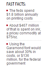
“Ink is two times more expensive than French perfume by volume,” the wise teen told CNN, pointing to the $38 cost of Chanel No. 5 perfume and the $75 an ounce of Hewlett-Packard printer ink will set you back. The feds spend some $1.8 billion in printing costs annually, and have tried double-sided printing and using recycled paper to cut costs. But finding ways to save on annual ink costs of $467 million is a new frontier. Using Garamond would save some 30% on those costs, about $136 million, while if local and state governments followed suit, about $234 million could be cut.

Suvir first conducted his font experiment on a smaller level, looking at the possible savings within his school districts. When he discovered the change could lead to some $21,000 in savings, he took it to the next level and looked at government costs. He submitted his startling findings to the Journal for Emerging Investigators, a journal that publishes research by teens, and the founders of which were blown away by the results.


“We were so impressed,” JEI’s Sarah Fankhauser told CNN. “We really could really see the real-world application in Suvir's paper."

It’s unlikely the feds will take action on Suvir’s say so. A spokesman for the Government Printing Office said efforts towards sustainability have already begun — and as more content goes online, less documents need printing.

"In 1994, we were producing 20,000 copies a day of both the Federal Register and Congressional Record,” Gary Somerset told CNN. “Twenty years later, we produce roughly 2,500 print copies a day.”

Suvir, though, says no matter what happens, some things will need to be printed — and that making a change, even for less documents, remains worthwhile.

"I recognize it's difficult to change someone's behavior. That's the most difficult part,” he told CNN. “I definitely would love to see some actual changes and I'd be happy to go as far as possible to make that change possible.

As you can see, being innovative and thinking outside the box can really pay off. Keep in touch and let us help you maximize the benefits of your printing. Call 877.990.1616 or visit us on the web www.marketinkgroup.com


Thursday, April 3, 2014

Sexy Packaging: A Powerful Wrap

Today’s post is lighthearted yet thoroughly clever. There are thousands upon thousands of brands out there, and it’s nice to know they’ve got some creativity and pizzazz. We want to showcase the most innovative, unique, memorable, and creative packaging design ideas from all over the world. With a creative and appealing package design, you can make your products and services stand out among the rest.

 Design is everywhere you look, including food packaging. Every single item you buy has probably been through a design process. Once a person has already experienced a trustworthy product, he or she tries something new rather unwillingly.  If you already have a successful business but you want to improve it, try creative product packaging designs for limited series of your items.

Clever packaging not only attract potential customers’ attention but also influence the buying decision. So your goal is to make your product stand out. This can be easily achieved if you pay special attention to creative product packaging designs.

The ultimate goal is to make your product stand out. Check out these creative and even provocative packaging concepts. As always, remember us here at Marketink. Get Faster and More Reliable Printing, Banners and Large Graphics. Call us if you need us: 877.990.1616